MHP presented the company's updated logo
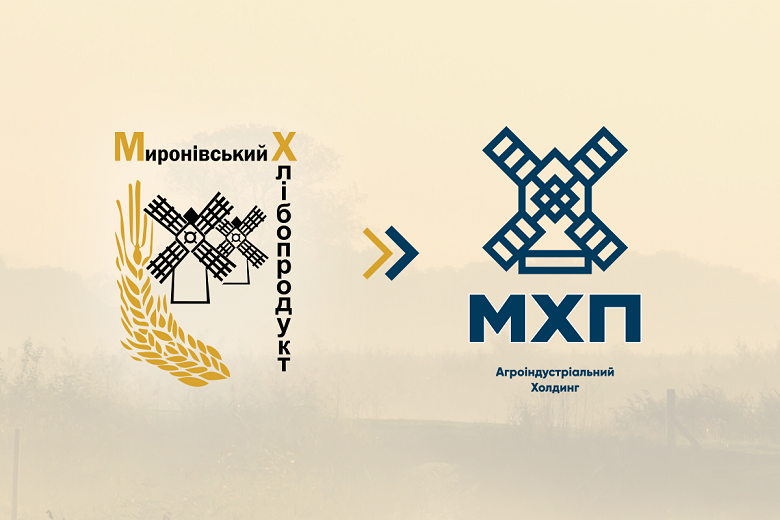
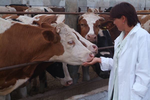
Photo by: MHP
The company Myronivsky Hliboproduсt (MHP) presented group restyling on November 7, 2017.
The company informs that corporate style and logo was created in cooperation with the Ukrainian branding agency Tough Slate Design under the guidance of Dmitry Tsapko, creative director and owner of the agency.
"The key task of restyling was to preserve the historical symbol in the logo and to move away from the association with grain production. Also, the new logo should laconically represent MHP abroad due to the active expansion of the company in the world. The positioning of the company as the leader of the Ukrainian agrarian market remained unchanged," said Alena Kuzmenko, director of public relations and corporate social responsibility of the MHP.
According to her, a new sign is the transformation of the historical element — mill, which is present in the company's logo since 1998. The new mill has become modern, minimalistic, but retained the authenticity of the original sign, and the history of the company with it.
"By reducing the name from Myronivsky Hliboproduct to MHP, the logo looks modern and easy to understand. A descriptor briefly explains what the company is doing and demonstrates its scale. The geometry of the logo in the form of a mill symbolizes movement and target, emphasizing the main idea — the continuous achievement of the result. Visual changes will be gradually broadcasted to the MHP Group. All of them will be united by a single corporate style and have their own updated logo taking into account the main logo of the MHP," the message says.